SWA Application Example
In this page we will examine a “default” SWA application included with TopBraid to understand how it has been constructed. You can open this application and examine its contents by opening defaultapp.ui.ttlx file in the TopBraid project. Remember to unlock it first. As you read this page, it may be useful for you to navigate to the application elements in the application file. Alternatively, you may want to create your own application based on this template. To do so right-click on a project you want to place the application in and select from the menu New then SWA Application based on Template. This will create and open a new application with all component assets copied from the selected template. To experience the default application in action, open any graph in TopBraid Composer Maestro Edition and then click on Model>Open with SWA Default Application …
To fully understand this example, you should have a basic understanding of SPARQL Web Pages – recommended reading is the SWP User Guide. In particular you need to be familiar with SWP’s variable scoping and let assignments.
Many rich internet applications divide the screen into various areas that can be re-sized using dividers. In the default application, there is a tree on the left (“west”) panel, a search form with its results on the right (“east”) and a view form occupies the rest (“center”) of the screen. SWA makes use of the jQuery UI Layout framework, and provides a convenience layer around it to help users get started quickly.
The class swa:FullScreenBorderLayout should be the top-level element in your application if you want to work with resizable areas. It can have up to five children, for the individual screen areas, as described in the documentation below. The top-level means that you can find it in the ui:prototype field when you look at the Application class in defaultapp.ui.ttlx.
-
arg:deepLinkingEvent(xsd:string): [Optional] The name of an event that shall be published and subscribed to for “deep linking”. If set, then the value of the data payload of the event will be placed behind the # of the browser URL. JavaScript code is used to make sure that whenever this value changes (e.g. when the user hits the Back button), then the event is re-published. In a typical scenario, the deep linking event may be the “resourceSelected” event that other components on the screen subscribe to.
-
arg:eastFixed(xsd:boolean): [Optional] True to make the eastern panel not resizable.
-
arg:eastSize(xsd:integer): [Optional] The pixel size of the east panel.
-
arg:northFixed(xsd:boolean): [Optional] True to make the north panel not resizable.
-
arg:northSize(xsd:integer): [Optional] The pixel size of the north panel.
-
arg:southFixed(xsd:boolean): [Optional] True to make the south panel not resizable.
-
arg:southSize(xsd:integer): [Optional] The pixel size of the south panel.
-
arg:suppressInitializer(xsd:boolean): [Optional] True to not include the swa:Initializer.
-
arg:westFixed(xsd:boolean): [Optional] True to make the west panel not resizable.
-
arg:westSize(xsd:integer): [Optional] The pixel size of the west panel.
The application’s main views are organized into so-called gadgets. A gadget is declared as a subclass of swa:Gadgets.
SWA already includes a small collection of reusable default gadgets, described on the SWA Gadgets Reference page.
The default application demonstrates how gadgets, the subclasses of swa:Gadgets, are defined. In order to embed gadgets into a stand-alone SWP application, we recommend to wrap it with a swa:Window. An swa:Window is a simple container around one or more content widgets and has a title header above it. Every swa:Window also has the notable feature to reload its content through a simple JavaScript call (swa:load()) which covers a lot of use cases if gadgets need to refresh in response to an event.
The content of a Window can be reloaded through an Ajax call, using the JavaScript functions swa:load or swa:loadWithResource.
-
arg:closable(xsd:boolean): [Optional] True to include a close button into the header. NOT IMPLEMENTED YET.
-
arg:id(xsd:string): The (HTML and ui:loadable) id to use for this Window. Must be a string constant – no variables or other expressions allowed!
-
arg:layoutPanel(xsd:string): The position within the surrounding BorderLayout: one of “east”, “north”, “west”, “south” or “center”.
-
arg:maximizable(xsd:boolean): [Optional] True to include a maximize button into the header. NOT IMPLEMENTED YET.
-
arg:minimizable(xsd:boolean): [Optional] True to include a minimize button into the header. NOT IMPLEMENTED YET.
-
arg:title(xsd:string): The label in the header.
This element is mainly provided as a convenience. For more options you may want to rather use jQuery UI Layout directly or create your own extension of this class based on a clone.
Anatomy of the Default Application
The first task in the ui:prototype of the default application is to configure the jQuery Bordered Layout.
1   <swa:FullScreenBorderLayout arg:deepLinkingEvent="org.defaultapp.instanceSelected"
2       arg:eastSize="400"
3       arg:northFixed="true"
4       arg:westSize="300"
5       let:classSelectedEvent="org.defaultapp.classSelected"
6       let:instanceSelectedEvent="org.defaultapp.instanceSelected"
7       let:rootClass="{= COALESCE(?rootClass, owl:Thing) }">
Next the header is built with a call to defaultapp:ApplicationHeader.
1 <defaultapp:ApplicationHeader/>
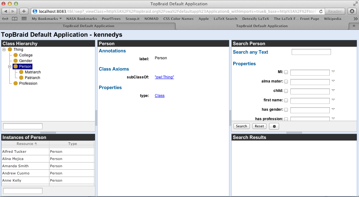
Two windows make up the west area. The first holds a TreeGadget for displaying a hierarchical view of classes. This is specified in lines 3 to 7. Below this is a window for showing results (lines 8..12).
Setting the argument arg:resourceSelectedEvent to ?instanceSelectedEvent allows the URI of a selected resource to be set (line 5). This event is caught by both the InstancesGridGadget and the FormGadget in the center of the UI. Instances are rendered using a specialization of a GridGadget (line 11).
1   <swa:BorderLayout arg:layoutPanel="west"
2       arg:southSize="200">
3       <swa:Window arg:layoutPanel="center"
4           arg:title="Class Hierarchy">
5           <swa:ClassTreeGadget arg:resourceSelectedEvent="{= ?instanceSelectedEvent }"
6               ui:args="*"/>
7       </swa:Window>
8       <swa:Window arg:id="defaultappInstancesWindow"
9           arg:layoutPanel="south"
10          arg:title="Instances">
11          <swa:InstancesGridGadget ui:args="*"/>
12      </swa:Window>
13  </swa:BorderLayout>
In the center of the UI is a FormGadget. The form shows whatever instance is selected as passed in the argument ?instanceSelectedEvent (line 4).
1   <swa:Window arg:id="defaultappFormWindow"
2       arg:layoutPanel="center"
3       arg:title="Selected Resource">
4       <swa:ViewFormGadget arg:resourceSelectedEvent="{= ?instanceSelectedEvent }"
5           ui:args="*"/>
6   </swa:Window>
The east window is also made up of two windows.
1   <swa:BorderLayout arg:layoutPanel="east"
2       arg:southSize="200">
3       <swa:Window arg:id="defaultappSearchWindow"
4           arg:layoutPanel="center"
5           arg:title="Search">
6           <swa:FormSearchGadget arg:resourceType="{= COALESCE(?resourceType, ?rootClass) }"
7               ui:args="*"/>
8       </swa:Window>
9       <swa:Window arg:layoutPanel="south"
10          arg:title="Search Results">
11          <swa:GridSearchResultsGadget arg:resourceSelectedEvent="{= ?instanceSelectedEvent }"
12              ui:args="*"/>
13      </swa:Window>
14  </swa:BorderLayout>
The full implementation of the ui:prototype of defaultapp:Application is shown below.
1   <swa:FullScreenBorderLayout arg:deepLinkingEvent="org.defaultapp.instanceSelected"
2       arg:eastSize="400"
3       arg:northFixed="true"
4       arg:westSize="300"
5       let:classSelectedEvent="org.defaultapp.classSelected"
6       let:instanceSelectedEvent="org.defaultapp.instanceSelected"
7       let:rootClass="{= COALESCE(?rootClass, owl:Thing) }">
8       <defaultapp:ApplicationHeader/>
9       <swa:BorderLayout arg:layoutPanel="west"
10          arg:southSize="200">
11          <swa:Window arg:layoutPanel="center"
12              arg:title="Class Hierarchy">
13              <swa:ClassTreeGadget arg:resourceSelectedEvent="{= ?instanceSelectedEvent }"
14                  ui:args="*"/>
15          </swa:Window>
16          <swa:Window arg:id="defaultappInstancesWindow"
17              arg:layoutPanel="south"
18              arg:title="Instances">
19              <swa:InstancesGridGadget ui:args="*"/>
20          </swa:Window>
21      </swa:BorderLayout>
22      <swa:Window arg:id="defaultappFormWindow"
23          arg:layoutPanel="center"
24          arg:title="Selected Resource">
25          <swa:ViewFormGadget arg:resourceSelectedEvent="{= ?instanceSelectedEvent }"
26              ui:args="*"/>
27      </swa:Window>
28      <swa:BorderLayout arg:layoutPanel="east"
29          arg:southSize="200">
30          <swa:Window arg:id="defaultappSearchWindow"
31              arg:layoutPanel="center"
32              arg:title="Search">
33              <swa:FormSearchGadget arg:resourceType="{= COALESCE(?resourceType, ?rootClass) }"
34                  ui:args="*"/>
35          </swa:Window>
36          <swa:Window arg:layoutPanel="south"
37              arg:title="Search Results">
38              <swa:GridSearchResultsGadget arg:resourceSelectedEvent="{= ?instanceSelectedEvent }"
39                  ui:args="*"/>
40          </swa:Window>
41      </swa:BorderLayout>
42  </swa:FullScreenBorderLayout>
If you need to further divide a top-level panel, e.g. to have two or more sub-panels on the left side like in the default application, then you can use swa:BorderLayout.
The code above established the layout of the application and all UI components that will be used.