Configuring the Editor UI
Custom Icons for Assets
EDG includes support for custom icons to be displayed in hierarchies and on forms.
A custom icon can be declared to be the same for all members of a class (e.g., the same icon for all countries) or it can be declared as a value of a property resulting in different icons for assets of the same type. The following figure shows an example.
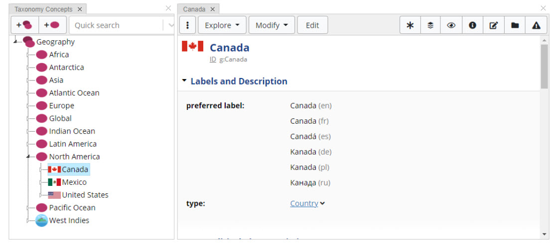
TopBraid EDG Custom Icon
These are set up by using the ‘dash:IconRole’ setting on a Property Shape.
See DASH Icon Role for details.
Configuring Editor UI
Editor Layout View
Editor applications are composed of panels that are combined to form layouts. Multiple layouts are available. Each collection type has its own default layout. Users can change these defaults.
For example, the default layout for business glossaries will have two panels – Search and Form, looking as follows:
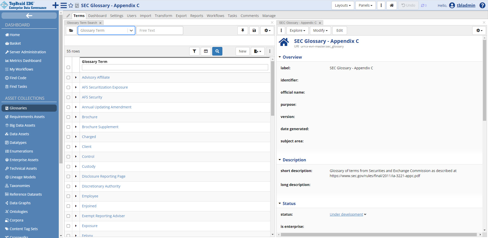
TopBraid EDG SEC Glossary - Appendix C Page
While for an ontology (asset collection that defines schema for other collections), the default editor layout will have panels looking as follows:
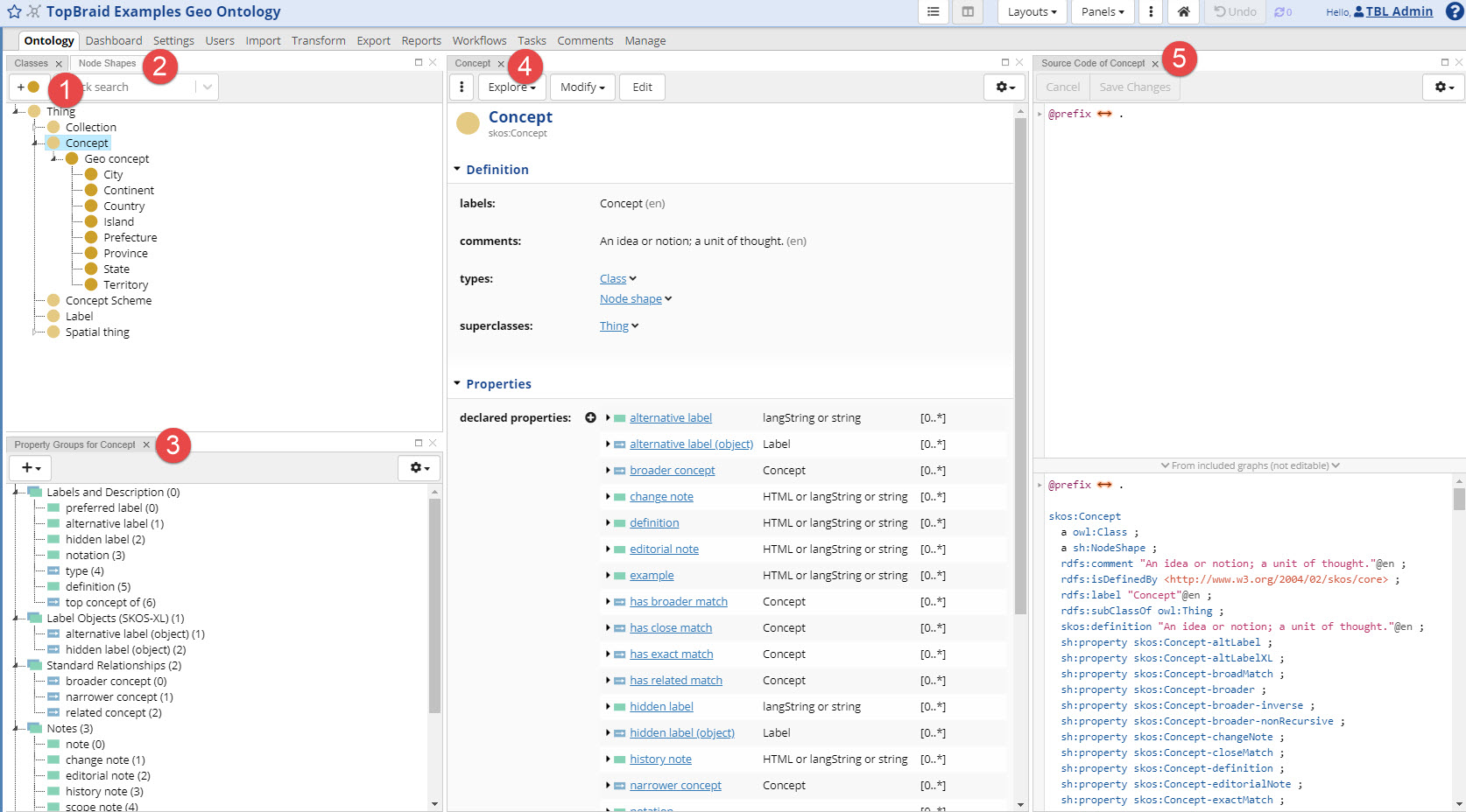
TopBraid EDG Examples GEO Ontology Page
Selecting and Arranging Panels
Each panel can be displayed in the entire with of the screen by closing all other panels. This is useful when you need more screen real estate for working. To reset the layout, just select a layout from the menu and your panels will come back. Or you can drag them back into view from the panels menu. The next image shows how the Glossary Editor Application would look if the Form panel was stand-alone.
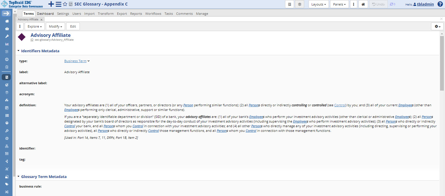
TopBraid EDG Advisory Affiliate Page
Panels can also be rearranged by dragging and dropping. Panels can be stacked behind each other in the same screen area. In the image below, the Change History panel is stacked behind the Form panel.
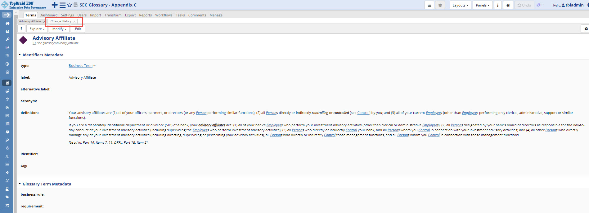
TopBraid EDG Advisory Affiliate Change History Page
Panels can be closed by clicking on the ‘x’ button in the panel’s header. This action removes a panel from a page.
Clicking on the Panels button displays additional selection of panels to add to a page.
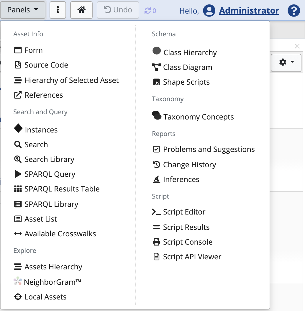
TopBraid EDG Panels List Dropdown
All available panels are described below, organized into categories:
Asset Information Panels
Attachments Panel (available when S3 is configured)
Search and Query Panels
Explore Panels
Map Explorer Panel (available when Google API key is enabled)
Show EDG Diagram (see Using EDG Diagrams)
Schema Panels
Node Shapes Panel (only Ontology Editor)
Property Groups Panel (only Ontology Editor)
RDF/OWL Properties List Panel (only Ontology Editor)
shape_scripts_panel (only Ontology Editor if scripts are enabled)
Taxonomy Panels
Reports Panels
Scripts Panels (available if scripts are enabled)
script_editor_panel_target
script_results_panel
script_api_viewer_panel
Some panels can be placed on a page more than once and remain in the menu even if they already exist on a page. Other panels make sense only once per page and, when already shown on a page, they no longer appear in the menu.
Some panels may have a pin icon – for example, if two forms are open. Pining a panel down will ensure that its content will not change if another panel is clicked.
Once a panel is added or removed from a page, that choice is remembered for the user in their next session.
Using Layouts
The Layouts button save arrangements of panels as a layout. Users can also switch to one of the existing layouts.
A saved layout can be made available to other users or kept private. It could also be declared as a new default only for the user who created it or for others as well.
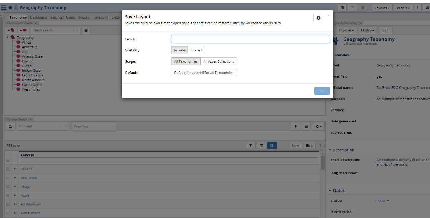
TopBraid EDG Save Layout Dialog Box
Pre-built layouts are:
Default layout for the selected collection type
Single Form Layout – displays only the form for the selected resource
SPARQL Layout – provides a way to run SPARQL queries as an alternative to clicking on the Export tab > SPARQL Endpoint. Unlike the option on the Export tab, it is fully integrated with the editor.
Classes and Instance Layout – useful for Enumerated values.
Search Layout – a convenient page layout for Search operations, combines Search, Search Library and Form panels
Problems and Suggestions Layout – provides a way to execute Problems and Suggestions checking
The Layouts menu also lets you manage existing layouts by selecting “Available Layouts”.
Using Editor-wide Configuration Settings
More icon in the header provides access to application settings and additional navigation options for user UX personalization. These settings are locally stored per user and won’t effect other users.
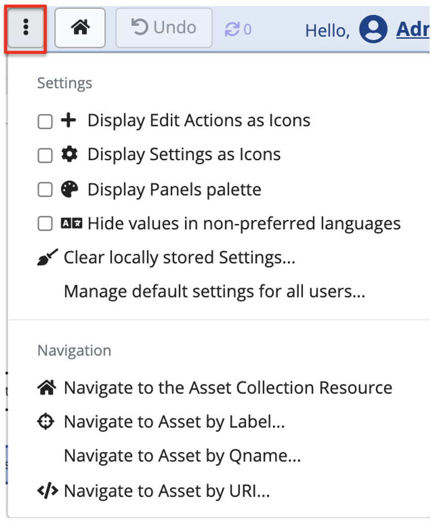
TopBraid EDG Editor-wide Configuration Settings Dropdown
Display Edit Actions as Icons button turns various menu options into icons and vice versa. By default, Display Actions as icons is checked. Unchecking it will impact all panels that have Create New actions and there is more than one action in a panel. Currently, these are Property Groups and Taxonomy Concepts panels. Instead of the icons, we will see Add menu with dropdowns. For example:
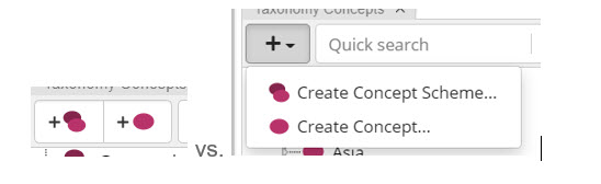
TopBraid EDG Create Concept Methods
Checking the option to Display Settings as icons will impact every panel that has a Settings menu (gear icorn). Instead of the menu, we will see icons for each option.
Checking Display Panels palette option, will place in the header an icon for each panel – as shown in the screenshot below.

TopBraid EDG Panels Palette View
Clear locally stored Settings button will clear out any personalization of the UI with the exception of the Layouts as those are stored in the system, not the browser. Any check box, Asset List, or other personalization you have made will be reset.
Checking Hide values in non-preferred languages option will hide property values tagged with languages that are not set in your browser as one of your preferred language.
Manage default settings for all users … button will appear only if you have Manager profile for a collection. It will display a page where you can pre-set panel Settings for all users of a collection. For example, you can use it to ensure that for all users, when they look at the content of the current asset collection, the Form will show properties even if they don’t have any values.
The remainder of the menu is navigation/search options.
Local Search Options
This option is available only if the asset collection editor offers Search Panel.
When using Search Panel, there is an option, Return local results only, which excludes results that come from included asset collections. (A local search only delivers resources having their rdf:type triple in the base graph.)
By default, users can choose for themselves whether to enable or disable this local results option on any particular search. However, managers can permanently set this option as either always local or always global for all users. If set by a manager, then users will still see the setting value on their search panes, but they will not be able to change it.
Main Class of Search Panel
This option is available only if the asset collection editor offers Search Panel.
It impacts the Type Selector in the Search panel, determining what will be shown in its drop-down list and what will be the root of the browsable hierarchical navigator listing available asset types. Each asset collection has a default main class. This option lets you modify the default.
Root of Class Hierarchy Panel
This option lets you reset which class will be shown as the root in the Class Hierarchy Panel.
The default root is Thing. However, you can use this option to limit the class tree to one of the subclasses of the owl:Thing class. You can also use this option to go “up the tree” by setting the root to rdfs:Resource class or any of its subclasses that are different from owl:Thing.
Root Shape of Asset Hierarchy Panel
When using Assets Hierarchy Panel, users can select a shape of resources to be displayed as roots in this panel.
If you select a shape here, it will be used as default for the panel. Users can still switch to another shape.
If nothing is selected here, the panel will be empty until a user explicitly selects a root shape.
Also Create Global OWL Properties
If activated, EDG will produce an owl:DatatypeProperty or owl:ObjectProperty type statement for a property when a new SHACL property shape is created.